|
Unseen in Plain Sight
|
Critical Investigation
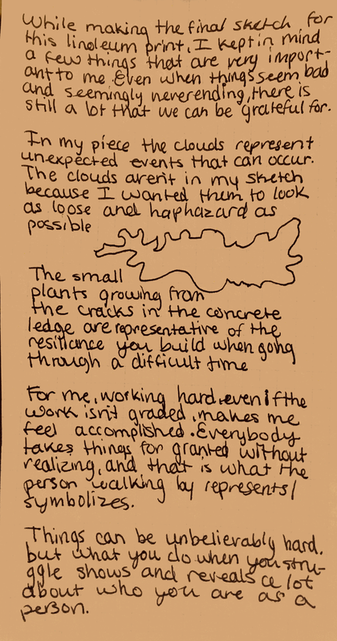
Inspiration Kathe Kollwitz "The Mothers" uses highlights to create the realism and Because lino and block prints are an entirely subtractive art, sketching out the highlights is the best way to prepare to cut into the wood or linoleum. Kathe Kollwitz was very affected by WWI and used her block print to represent the pain and struggles of mothers, children, and other women during their times of uncertainty and loneliness. The pain that these people had to face alone was something that Kathe Kollwitz struggled ro express. Her inspiration came from Ernst Barlach's 1920 prints.
The wood print by Gerhard von Ruckteschell represents the chaos of daily life, when you have children and a million priorities. The two pieces have very different styles, which creates a different type of emphasis. "The Mothers" has a rather symmetrical balance, which seemingly creates a more calm and ominous feeling, while "Schreitende und Kinder" is asymmetrical, and feels chaotic. The composition and style of these two woodprints tells two very different stories, and it seems like they are nearly juxtapositions of each other. Ruckteschell's print visualizes getting stuck and frustrated in daily life, and Kollwitz' is the desire for a normal life by victims of war. Both of these are wood prints, so as far as trying to recreate these styles, that would be difficult and wouldn't create the feeling that I want to spark. I would like to use Kathe Kollwitz' conservative and simple method of highlighting to include the necessary amount of detail so that each object and person can be identified. Going with the second planning sketch made the most sense when it came to the method of carving the block print. The background will be more similar to that of Ruckteschell's, because of my choice to use a simple but sufficient amount of details, through large shapes, fine lines, and figures. The presence of the figures is inspired by Ruckteschell, but the detail and style of the people is based more around work by Kollwitz. Gratitude is what I want the piece to symbolize, which does not apply to these two pieces very well. You can not tell or expect people who have been affected by war to be grateful for what they have. In my opinion, there is no way to insert gratitude into either of these pieces, so when it comes to symbols and meaning, I have gained my inspiration and ideas from life experiences, the people around me, and for the opportunities that I have to be successful in school and other endeavors. |
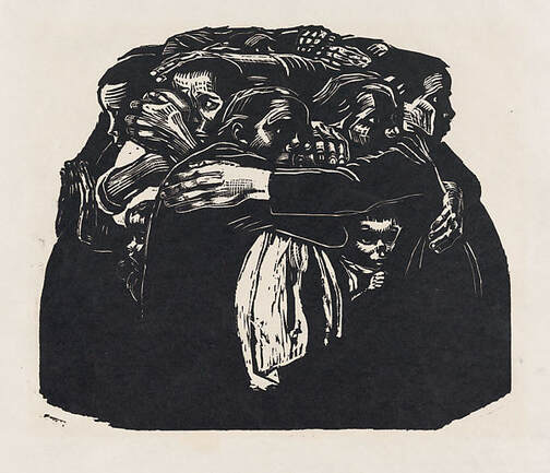
Kollwitz, Käthe. “The Mothers.” The Met, 1923, The Metropolitan Museum, New York, www.metmuseum.org/art/collection/search/398133.
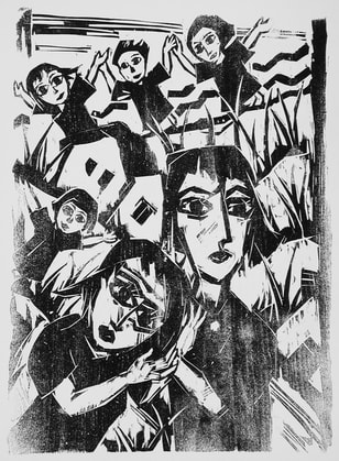
Ruckteschell, Gerhard. “Schreitende Und Kinder.” LACMA, UCLA, Los Angeles, 1977, LACMA, Los Angeles , collections.lacma.org/node/187112.
|
Planning
Planning Sketches
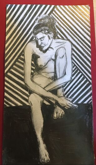
Nude Woman #1
|
This sketch is meant to represent vulnerability. In at least a few parts of our life, we are vulnerable, and especially for women, being nude is a time when we are truly vulnerable.
|
|
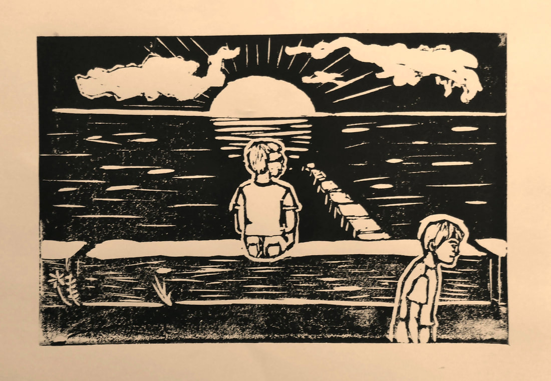
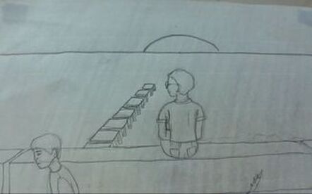
South Shore, MKEWhen I drew this, I did now use a reference, even though I am referring to a specific place. South Shore park is a place I have spent a lot of time at. Our cross country team would run here, there is a farmers market, and I have been on multiple dates there, so the memories are reference enough to draw this scene. The piece would represent gratitude and introspection. When someone has time to think about the things in their life, its more likely for them to be grateful.
|
|
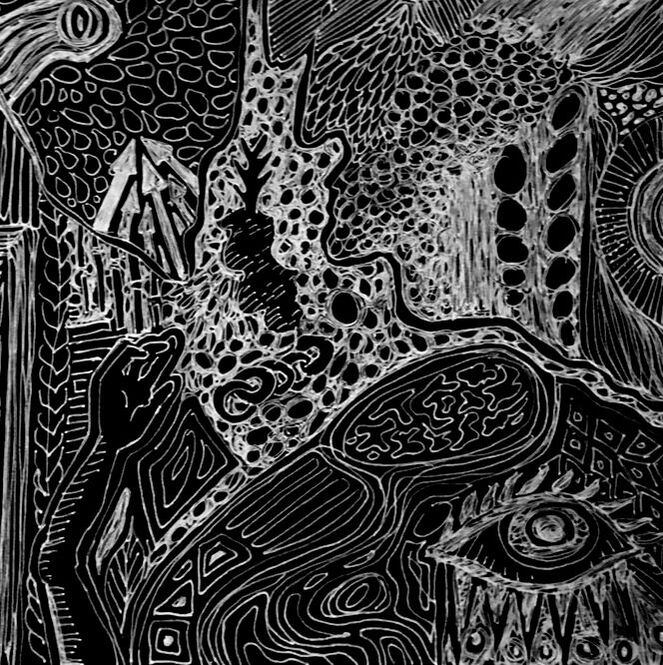
Line drawing #1 In Freshman year, in art, we created a piece of artwork with only a Sharpie pen and a piece of paper, and couldn't sketch with pencil first, where we created organic and geometric patterns. The idea is that you just draw. There are no plans or expectations, because there aren't identifiable objects.
Recently I have been experimenting with this type of art, when I don't know what to draw, because it gets my hand and head ready to make something else. Doing this for a lino print would be interesting, because not only would you be working on something with very little structure, but there would be a carver in your hand, instead of a pen. The stakes would be high, but however it looks when you feel like its finished is how it will be. It's a nice, simple project, but it is harder than it sounds. |
|
Process, Ideas, and Intentions
Ideas
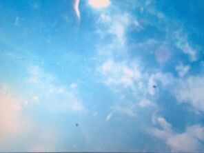
These two photos that I took were part of the idea process. Photography is something that I use, for the most part, as a way to portray nature. Even in pictures of random brown fields in the middle of the city, my goal to bring the natural life hidden in places like that, is usually very successful. Both photographs helped to create the idea of making clouds in the sky. Clouds are unpredictable and aren't always there, so that is the basis for using them as a symbol for struggles, discontentment, and other issues that people face every day.
My dad has always said that being smart is nice and all, but being hardworking is much more important. One of the main things that makes me sad is that I am not very good at finishing things, especially schoolwork. Working hard has never been an issue, but working hard on the right thing and working efficiently is incredibly difficult. While my dad is right about being a hard worker, working in a smart manner can be just as important. Because Art is a much more fluid class than any other within IB, finishing work is much more rewarding. When each project is made by making your own decisions, it is more of an accomplishment when it is done than for an assignment in a class like math. Once the initial carving was done, some people who work at Peck School of the Arts helped me by critiquing the first two prints. The main changes that they recommended were to add more texture into the water and somehow make the sky more complex. The changes were made, as seen in the experimental photos, and it turned out to look so much better and create more unity throughout the entire piece, simply by adding a few more straight lines. |
|
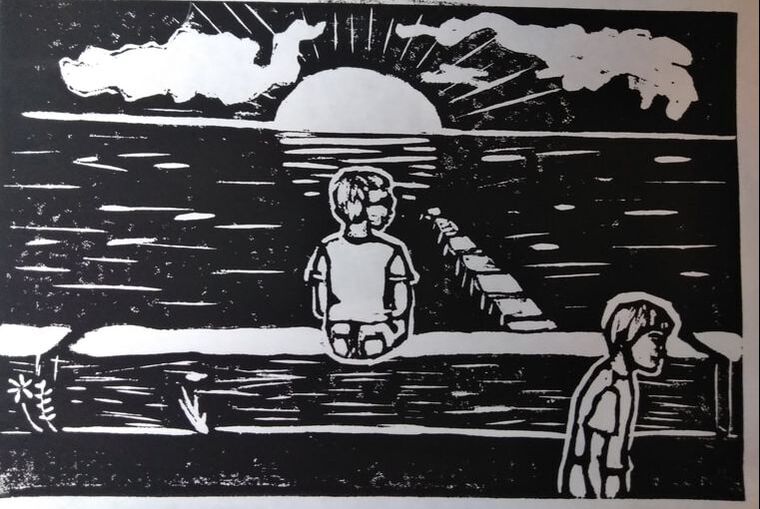
Physical Process
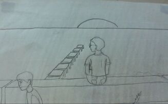
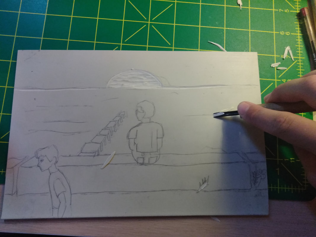
Picture 1: This was after I drew the sketch, and applied a 8B graphite stump to the back to transfer the image onto the linoleum. The sketch took about twenty-five minutes or so. The most difficult thing to draw was the dock, mostly because I needed to make it look simple enough to carve with a linoleum carver.
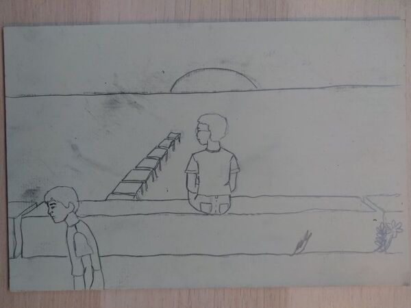
Picture 2: The linoleum worked very well to transfer the sketch on to, but after, I went over each line again, so it was very clear where to carve, and where to keep black. It is recommended to use the transfer process, because it would be a waste of time and effort to draw the sketch again freehand.
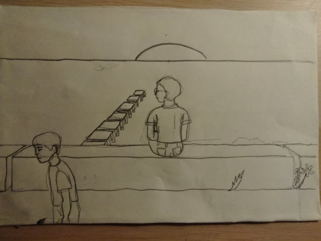
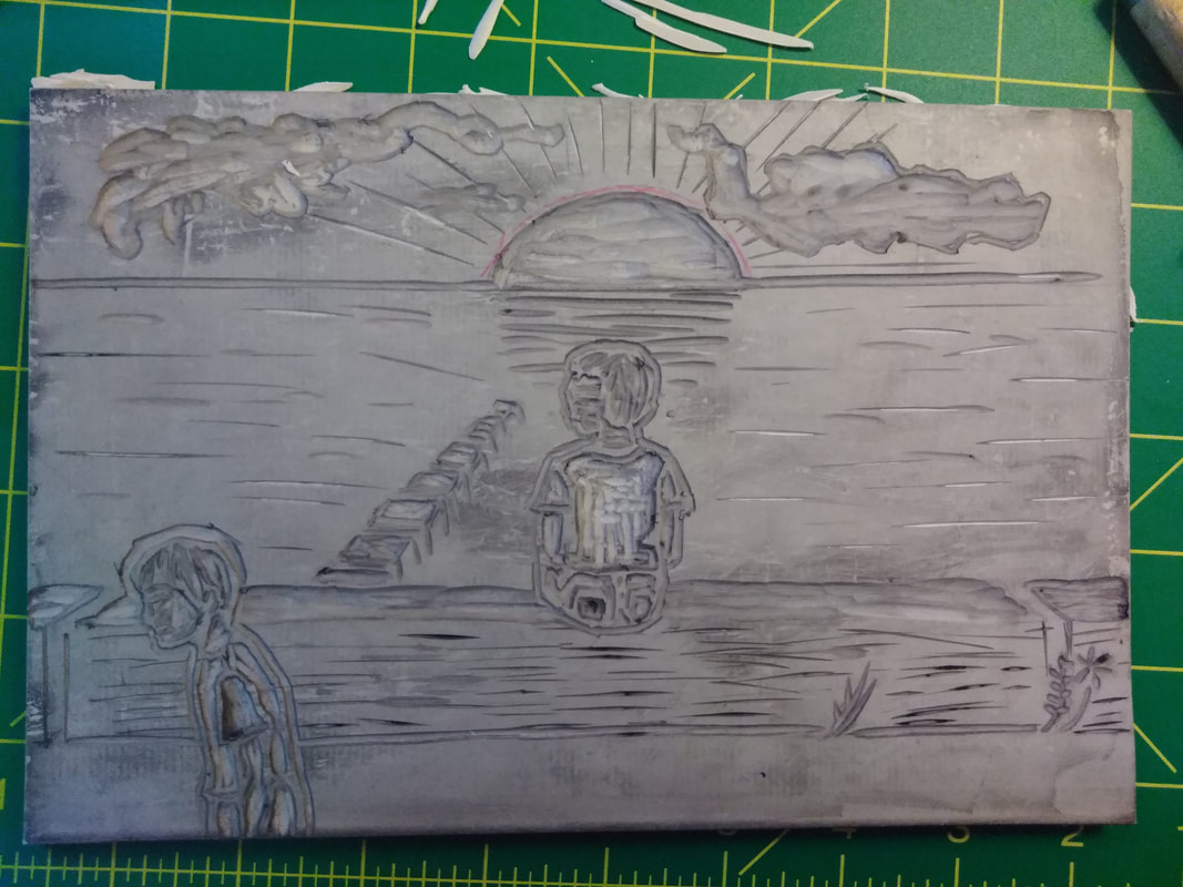
Picture 3: After I transferred the picture to the linoleum, I outlined the graphite sketch so that I can keep the drawing and it won't fade over time. What came to mind was coming up with a physical portfolio of all of the sketches and experimental pieces that I used, but that weren't the emphasis of the projects I do, so that the process is visualized and kept, for the future.
Picture 4: After I was done carving my linoleum, I realized that I did not take photos of the process, so I used the back of my finished carved lino block, and did a small sketch and carved a little out, just so that the process for that is shown within my portfolio. For the areas that had shapes fully white, I used the widest u-shaped carver and for very fine lines, I used the one that is shaped like a V.
Picture 5: Finally, the carving is done! The carving took a very long time, and I stabbed myself in the thumb, even though I was carving away from myself.
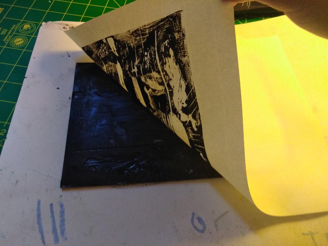
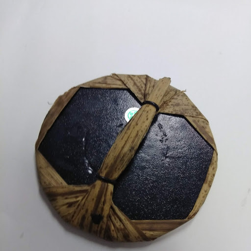
Picture 6: To make the first copy, I used a roller to evenly apply block print ink onto the linoleum block. I placed a paper onto the linoleum, and used a baren(shown below) to rub the print several times and very firmly so that the ink transferred to the paper evenly, and without gaps or small white specks
Picture 2: The linoleum worked very well to transfer the sketch on to, but after, I went over each line again, so it was very clear where to carve, and where to keep black. It is recommended to use the transfer process, because it would be a waste of time and effort to draw the sketch again freehand.
Picture 3: After I transferred the picture to the linoleum, I outlined the graphite sketch so that I can keep the drawing and it won't fade over time. What came to mind was coming up with a physical portfolio of all of the sketches and experimental pieces that I used, but that weren't the emphasis of the projects I do, so that the process is visualized and kept, for the future.
Picture 4: After I was done carving my linoleum, I realized that I did not take photos of the process, so I used the back of my finished carved lino block, and did a small sketch and carved a little out, just so that the process for that is shown within my portfolio. For the areas that had shapes fully white, I used the widest u-shaped carver and for very fine lines, I used the one that is shaped like a V.
Picture 5: Finally, the carving is done! The carving took a very long time, and I stabbed myself in the thumb, even though I was carving away from myself.
Picture 6: To make the first copy, I used a roller to evenly apply block print ink onto the linoleum block. I placed a paper onto the linoleum, and used a baren(shown below) to rub the print several times and very firmly so that the ink transferred to the paper evenly, and without gaps or small white specks
Materials
|
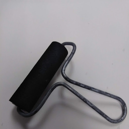
Brayer: Rolls the ink evenly and quickly onto the block of linoleum
|
Baren: Applies pressure to the paper against the lino block to transfer the ink
|
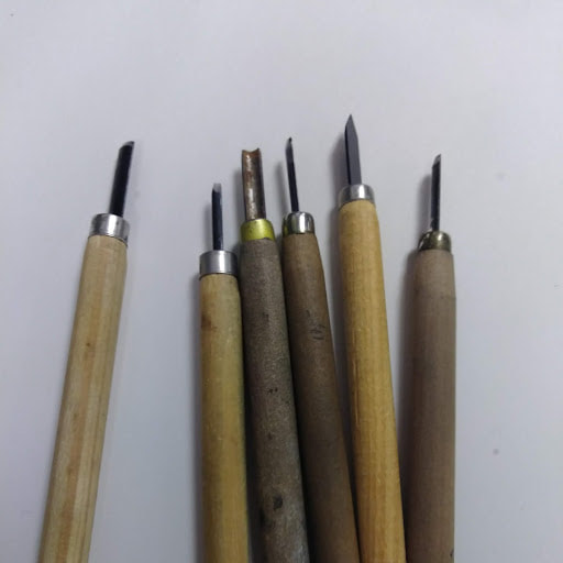
Carving Tools: Used to carve different widths and types of lines into the linoleum - always carve away from yourself!
|
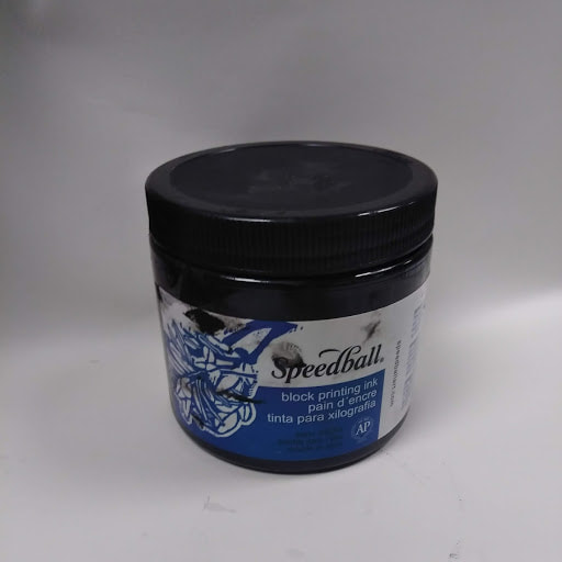
Ink: Block printing ink doesn't dry as quickly as acrylic paint, and can be washed off of the lino block after printing
|
Experimentation
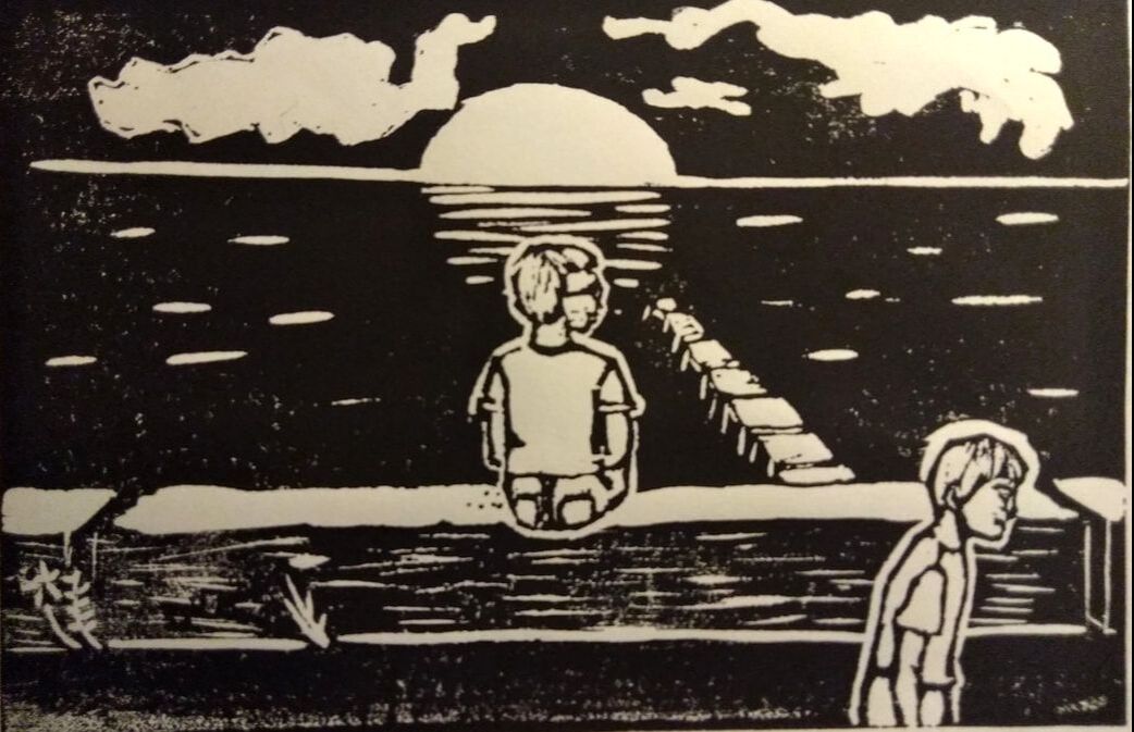
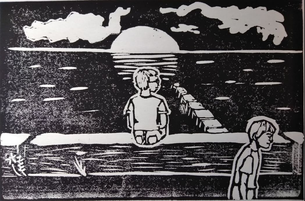
Carving the linoleum print was very relaxing, which made it easy to get the look that I was going for. While printing, my main problem was getting the ink to have a consistent opacity throughout the piece, but when I did get the consistent texture, I did not like it very much, so I made the changes to the block and then used a medium amount of ink to create the look in the third piece that I was going for. After I initially carved the block print, and made a few prints of that version, I went to Peck School of the Arts and I got a small critique from some people, and that helped me to decide to add the other details in the water and in the sky, which I think gave it more of a surreal look, more similar to Strollers and Children. Going through my photos taken during the course of this project, I found a print that I had forgot about, and that is now the copy that I am using as my final piece.
Critique/ Compare & Contrast My techniques I used to create my block print was very different from the way that my two inspiration pieces created theirs. First, a rather obvious change, is that both "The Mothers" and "Schreitende Und Kinder" were wood prints. According to MOMA, Kathe Kollwitz would make many sketches to prepare for the wood print. The sketches she would make would have a far more complex composition than the final piece, because she felt the need to simplify the work, by the time she got to the final woodcut.
The way that I do my artwork is very different from the way Kollwitz would. I tend to keep the project that I am working on in mind when looking through books, going on walks, and talking to people that inspire me, and once I have an idea for the meaning and symbolism that I would love to create art around, I sketch out some symbols, people, objects, and places that could relate to the theme, and then I tend to put it together after a while. Between my work and the inspiration for the work, the method of creating the people is very comparable to that of Ruckteschell's. The place where Kollwitz' style is most prominent is the dock. I carved just the minimum amount of linoleum to be able to identify it as a dock. |
Reflection While designing this print, using linoleum became for familiar. In my middle school art class, we did a linoleum project, but the purpose of the work was to be able to make many without spending a lot of time on each one. Getting into IB Art, I learned that Art is iterative, and can change meaning. In middle school, it wasn't really taught that Art has meaning. We were told that it did, but there was no explanation or emphasis on the interpretation or representations that are found within art.
If I were to begin this again, I would only change the print itself. Because I was unfamiliar to the carving process, there are certain things that I dislike about the textures and technique. The water, now that I look at it, takes up too much. When it comes to the texture on the water, creating more movement via carving longer lines and making them much thinner so that it looks more like a lake. Another thing that is rather noticeable is how the skyline is not straight, and is not quite horizontal. |
ACT Questions
Clearly explain how you are able to identify the cause/effect relationship between your inspiration and its effect on your artwork.
It is very visible that the style of the two figures has strong influences from Ruckteschell's piece. The way that every feature is left uncarved, then the area around is all carved, so that the faces and bodies look rather two dimensional, like the inspiration piece.
What is the overall approach the author has regarding the topic of your inspiration?
What I found to be true is that many people who publish the art explain what they believe the art is focused around and also explain the artist's approach and beliefs to use that as reasoning behind their interpretations of the art.
What kind of generalizations have you discovered about people, ideas, culture, etc. while you researched your inspiration?
There are a lot of beliefs about war, and the respect and honor that comes with dying at war. While these people are brave and deserve respect, I do not believe that war is a fundamental thing. The way schools teach about war, there is always a "good guy and a bad guy", but good and bad are subjective, and both sides are under the belief that the side they are fighting for is the "good side". Being a pacifist, seeing winning a war as the way for a country to be successful and gain peace seems contradicting. There is no way to deny that, in the world we live in, there is a way other than war, especially because certain members of our government encourage war.
What is the central idea around your inspirational research?
While the artwork is themed around gratitude, my inspirational research regarded German Expressionism during WWI and both, coincidentally involve motherhood. The fact that both pieces are about motherhood is rather ironic, given that I do not have a relationship with mine.
What kind of inferences did you make while reading your research?
I expected that the artists of my two inspiration pieces had negative opinions of war. They were both made in the same year, so reflecting on "Strollers and Children" there was one strong inference. The inference I made was that like in "The Mothers", the figures in "Strollers and Children" are lacking a father because this was made during war times, and the figures are children and a mother. Given that these two pieces are probably both about the struggles of women and children during war, it can be inferred that both artists see war as more of a tragedy than means of gaining freedom.
Bibliography
Kollwitz, Käthe. “Käthe Kollwitz. The Mothers (Die Mütter) from War (Krieg). 1921–22, Published 1923: MoMA.” The Museum of Modern Art, 2011, www.moma.org/collection/works/69687.
Kollwitz, Käthe. “The Mothers.” The Met, 1923, The Metropolitan Museum, New York, www.metmuseum.org/art/collection/search/398133.
Ruckteschell, Gerhard. “Schreitende Und Kinder.” LACMA, UCLA, Los Angeles, 1977, LACMA, Los Angeles , collections.lacma.org/node/187112.
Kollwitz, Käthe. “The Mothers.” The Met, 1923, The Metropolitan Museum, New York, www.metmuseum.org/art/collection/search/398133.
Ruckteschell, Gerhard. “Schreitende Und Kinder.” LACMA, UCLA, Los Angeles, 1977, LACMA, Los Angeles , collections.lacma.org/node/187112.
